Date picker
Color
Date input
| Element | Property | Color token |
|---|---|---|
| Label | text-color | $text-secondary |
| Field | background-color | $field * |
| border-bottom | $border-strong * | |
| Field text | text-color | $text-primary |
| Placeholder text | text-color | $text-placeholder |
| Helper text | text-color | $text-helper |
| Calendar icon | svg | $icon-primary |
* Denotes a contextual color token that will change values based on the layer it is placed on.
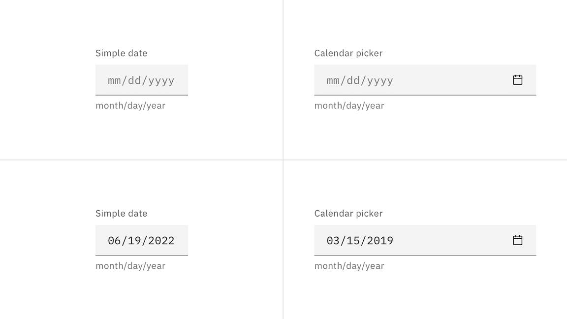
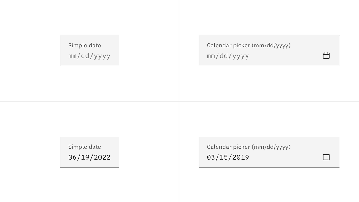
Interactive states
| State | Element | Property | Color token |
|---|---|---|---|
| Focus | Field | border | $focus |
| Invalid | Field | border | $support-error |
| Error message | text-color | $text-error | |
| Error icon | svg | $support-error | |
| Warning | Warning message | text-color | $text-primary |
| Warning icon | svg | $support-warning | |
| Disabled | Label | text-color | $text-disabled |
| Field | background-color | $field | |
| Field | border-bottom | transparent | |
| Field text | text-color | $text-disabled | |
| Calendar icon | svg | $icon-disabled |
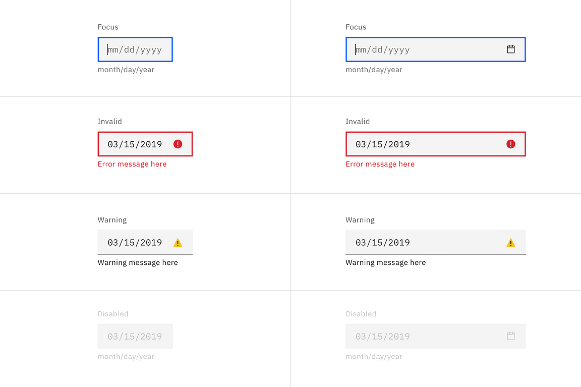
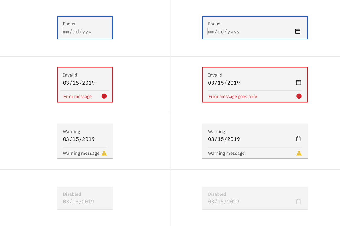
Examples of date picker input states
Calendar menu
| Element | Property | Color token |
|---|---|---|
| Calendar | background-color | $layer * |
| Calendar menu | box-shadow | 0 2px 6px 0 rgba(0, 0, 0, 0.2) |
| Today | text-color | $link-01 |
| Day | text-color | $text-primary |
| Day: hover | background-color | $layer-hover * |
| Day: focus | border | $focus |
| Day: disabled | text-color | $text-disabled |
| Day: selected | text-color | $text-on-color |
| background-color | $background-brand | |
| Day: in range | text-color | $text-primary |
| background-color | $highlight | |
| Day: end range | text-color | $text-primary |
| border | $focus | |
| Day: next month day | text-color | $text-secondary |
* Denotes a contextual color token that will change values based on the layer it is placed on.
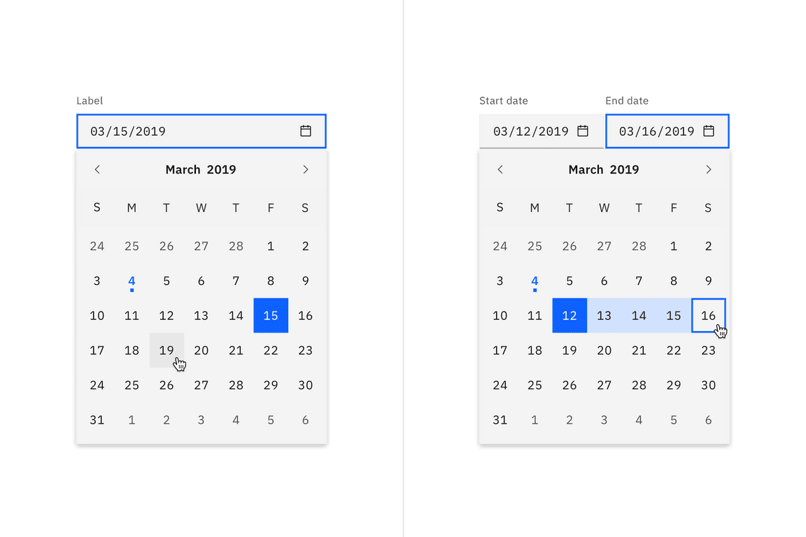
Example of a single date calendar picker (left) and a date range calendar picker (right).
Typography
Labels should be set in sentence case, with only the first word in a phrase and any proper nouns capitalized, and no more than three words.
| Element | Font-size | Font-weight | Type token |
|---|---|---|---|
| Label | 12 / 0.75 | Regular / 400 | $label-01 |
| Field text | 14 / 0.875 | Regular / 400 | $code-02 |
| Helper text | 12 / 0.75 | Regular / 400 | $label-01 |
| Error message | 12 / 0.75 | Regular / 400 | $label-01 |
| Warning message | 12 / 0.75 | Regular / 400 | $label-01 |
| Month and year | 14 / 0.875 | SemiBold / 600 | $heading-compact-01 |
| Day | 14 / 0.875 | Regular / 400 | $body-compact-01 |
Structure
Date inputs
Fixed input
The widths of the date inputs may vary based on the grid and layout.
| Element | Property | px / rem | Spacing token |
|---|---|---|---|
| Label | margin-bottom | 8 / 0.5 | $spacing-03 |
| Field | padding-left, padding-right | 16 / 1 | $spacing-05 |
| border-bottom | 1px | – | |
| Helper text | margin-top | 4 / .25 | $spacing-02 |
| Calendar icon | height, width | 16 / 1 | – |
| padding-left | 8 / 0.5 | $spacing-03 |
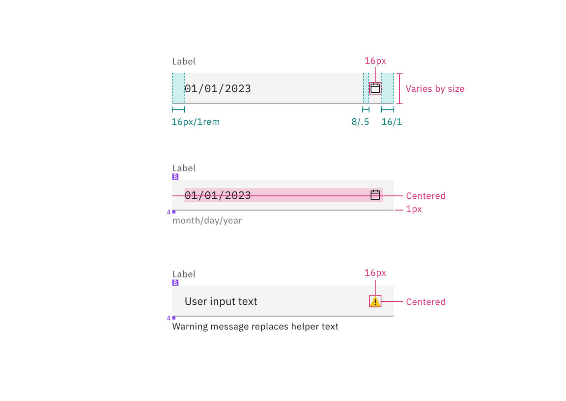
Structure and spacing for fixed date picker inputs | px / rem
Fluid input
The widths of the date inputs may vary based on the grid and layout.
| Element | Property | px / rem | Spacing token |
|---|---|---|---|
| Label | padding-bottom | 4 / 0.25 | $spacing-02 |
| Field | height | 64 / 4 | $spacing-10 |
| padding-left, padding-right | 16 / 1 | $spacing-05 | |
| padding-top, padding-bottom | 13 / 0.8125 | – | |
| border-bottom | 1px | – | |
| Calendar icon | height, width | 16 / 1 | – |
| padding-left | 8 / 0.5 | $spacing-03 | |
| Focus | border | 2px | – |
| Error | border | 2px | – |
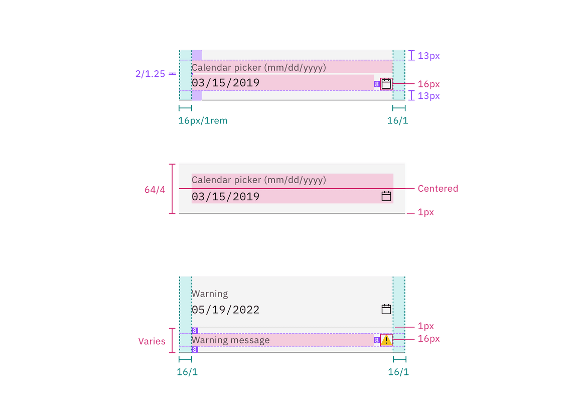
Structure and spacing for fluid date picker inputs | px / rem
Calendar menu
| Element | Property | px / rem | Spacing token |
|---|---|---|---|
| Calendar menu | height | 336 / 21 | – |
| width | 288 / 18 | – | |
| padding-top, padding-right, padding-left | 4 / 0.25 | $spacing-02 | |
| padding-bottom | 8 / 0.5 | $spacing-03 | |
| Day | height, width | 40 / 2.5 | – |
| Today: dot | height, width | 4 / 0.25 | – |
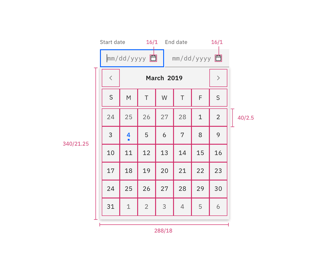
Structure for date picker | px / rem
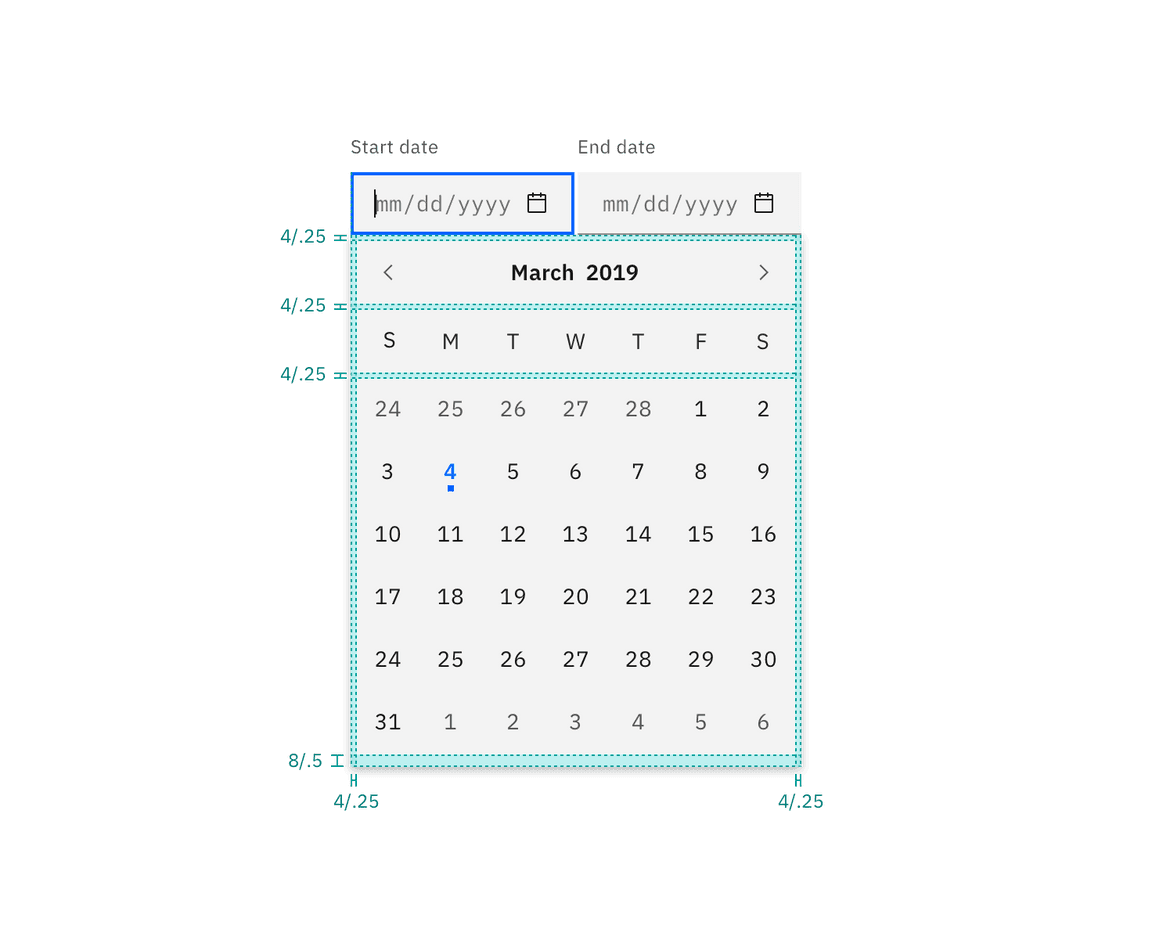
Spacing for date picker | px / rem
Time picker
The time picker is a combination of a text input and select component. Refer to each component page for further details.
Fixed input
The widths of the time picker may vary based on the grid and layout.
| Element | Property | px / rem | Spacing token |
|---|---|---|---|
| Label | padding-bottom | 8 / 0.5 | $spacing-03 |
| Field | height | 40 / 2.5 | – |
| padding-right, padding-left | 16 / 1 | $spacing-05 | |
| Select | padding-right, padding-left | 16 / 1 | $spacing-05 |
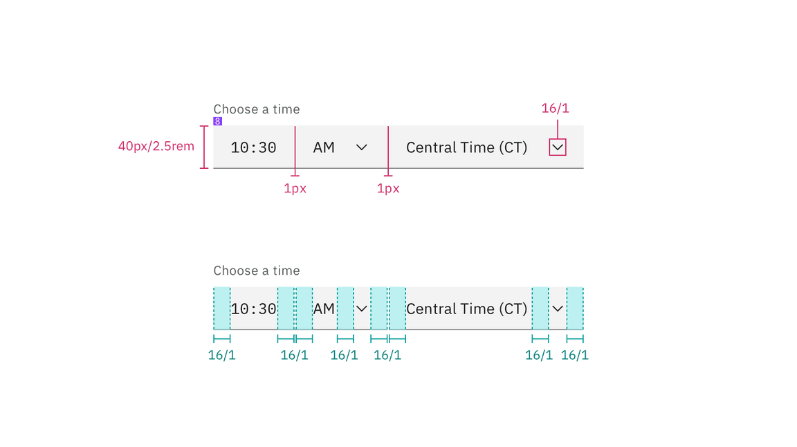
Structure and spacing for a time picker | px / rem
Fluid input
The width of each component in the fluid time picker is a percentage of the group. Time picker’s total width will vary based on the grid and layout
| Element | Property | px / rem | Spacing token |
|---|---|---|---|
| Label | padding-bottom | 4 / 0.25 | $spacing-02 |
| Field | height | 64 / 4 | – |
| padding-right, padding-left | 16 / 1 | $spacing-05 | |
| Divider | width | 1px | – |
| Time input | width | 25% or 50% | – |
| Clock select | width | 25% or 50% | – |
| Timezone select | width | 50% | – |
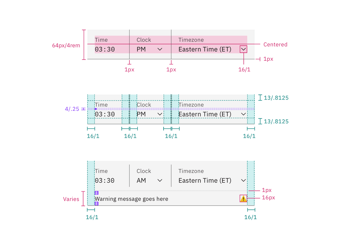
Structure and spacing for a time picker | px / rem
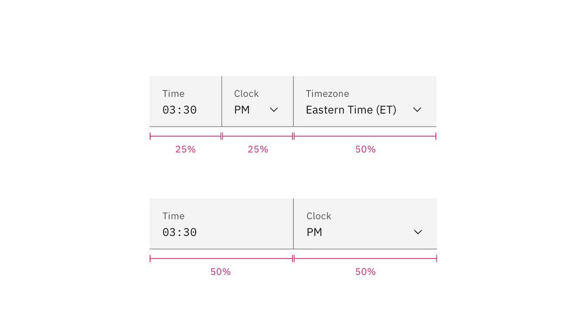
The width of each component in the fluid time picker is a percentage of the group.
Sizes
Fixed inputs
| Element | Size | Height px / rem |
|---|---|---|
| Field | Small (sm) | 32 / 2 |
| Medium (md) | 40 / 2.5 | |
| Large (lg) | 48 / 3 |
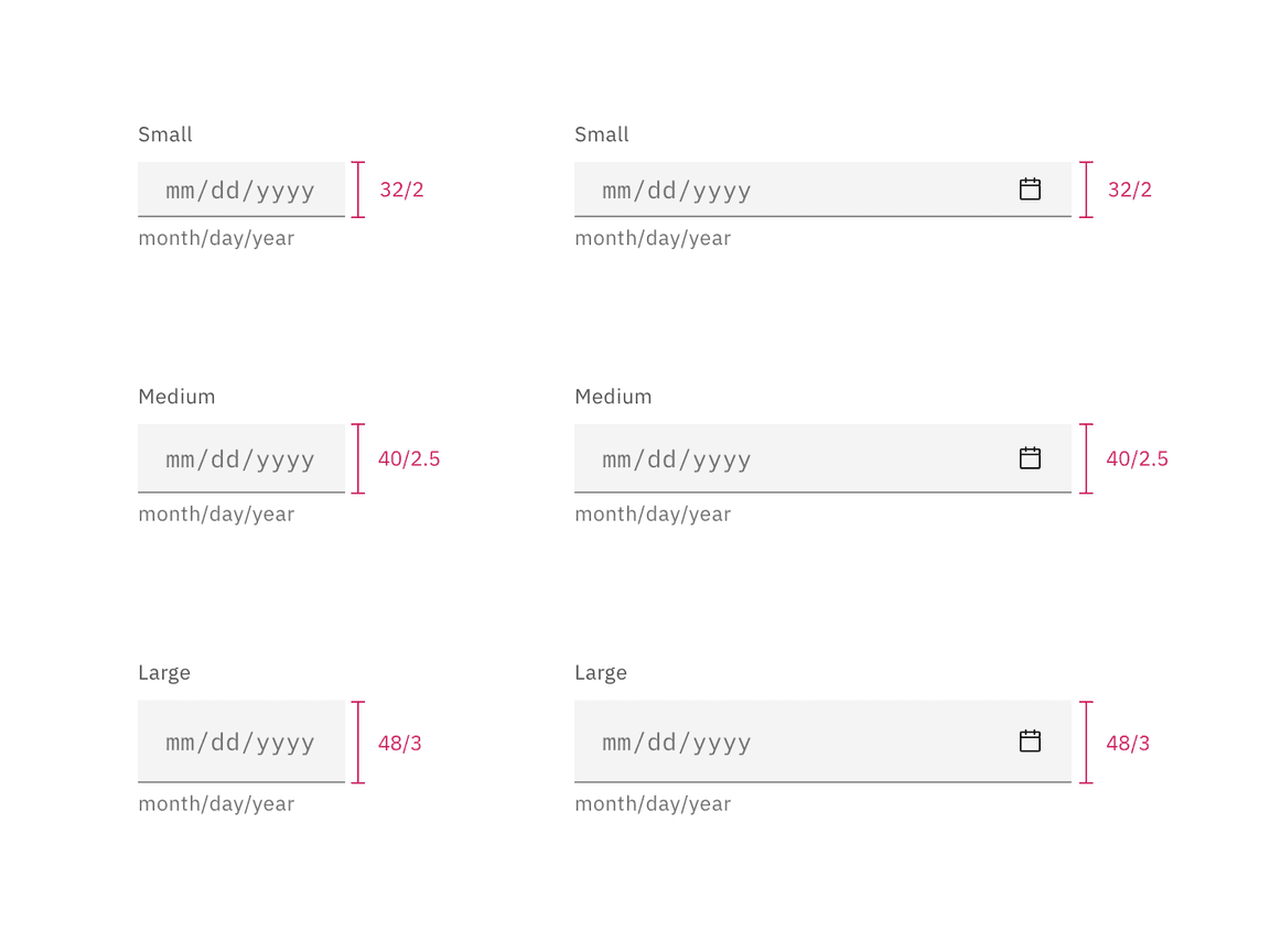
Sizes for simple and single date calendar sizes | px / rem